Understanding the Essential Components of a Venn Diagram
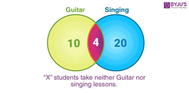
The concept of overlapping groups offers a fascinating way to visualize relationships between different entities. By exploring these connections, one can uncover shared characteristics and unique attributes that define each collection. This approach facilitates a deeper comprehension of how various categories interact and intersect.
When examining these relationships, it becomes essential to identify the areas where these groups coincide and where they diverge. Each segment serves a unique purpose, allowing for a clear representation of commonalities and distinctions. By recognizing these features, we can better analyze the interplay between distinct groups.
Ultimately, this analytical tool provides a framework for organizing complex information, making it accessible and comprehensible. Whether for educational purposes or data analysis, mastering the components of this visual representation enriches our understanding of how different classifications relate to one another.
Understanding Venn Diagrams
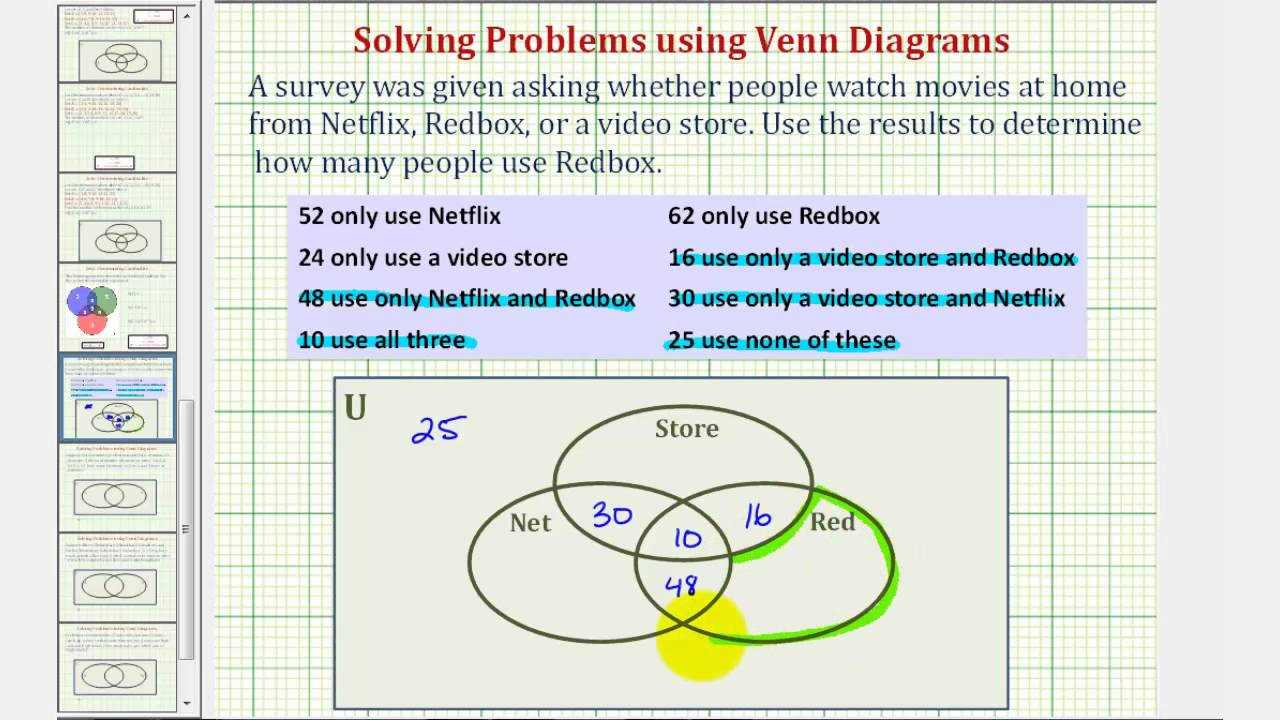
These visual representations are powerful tools for illustrating relationships and interactions between different sets. By employing overlapping circles, they provide clear insights into commonalities and differences, enabling a better grasp of complex concepts.
Key Elements of These Visual Tools

- Circles: Each circle signifies a unique collection of items or ideas.
- Overlap: The intersection of circles highlights shared characteristics or elements.
- Space Outside: The area outside the circles represents elements that do not belong to any of the depicted groups.
Applications in Various Fields
- Education: Used to compare and contrast topics, enhancing critical thinking.
- Data Analysis: Helpful in visualizing relationships in statistical data.
- Problem Solving: Assists in identifying common factors and unique traits in decision-making processes.
Basic Components of Venn Diagrams

Understanding the fundamental elements of these visual representations is crucial for effective communication of relationships between different sets. Each component plays a significant role in illustrating how items intersect, differ, or share commonalities. The clarity of these visuals relies heavily on the careful arrangement of their essential features.
Key Elements
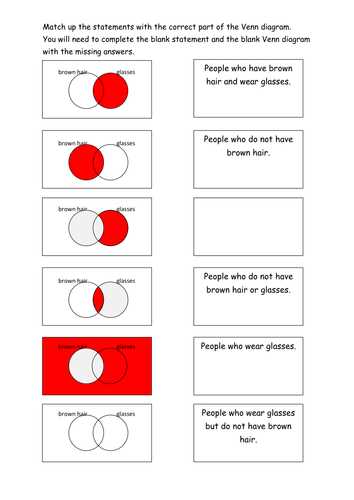
- Circles: The primary shapes that represent different sets or groups. Their placement and size can indicate the extent of overlap and distinctiveness.
- Intersections: The areas where circles overlap, illustrating shared characteristics or elements between the sets.
- Non-overlapping Areas: Sections of the circles that remain separate, highlighting unique traits of each group.
- Labels: Text used to identify each set, providing context and clarity to the relationships depicted.
Usage of Colors and Styles
- Color Coding: Different colors can enhance understanding by visually distinguishing between sets and their interactions.
- Shading: Techniques such as shading can further emphasize the intersections or unique parts of the sets.
By grasping these fundamental elements, one can effectively utilize these representations to analyze and communicate complex relationships in a visually appealing manner.
Types of Venn Diagrams Explained
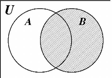
In the realm of visual representation, various configurations serve to illustrate relationships between distinct groups. Each variation emphasizes unique aspects of intersection, inclusion, or exclusivity, allowing for a deeper understanding of complex data. By categorizing these forms, we can better appreciate their applications across different fields.
One common form features two overlapping circles, effectively showcasing shared characteristics between two entities. This simple yet powerful design facilitates clear comparisons and highlights commonalities and differences.
Another variant incorporates three or more circles, expanding the scope of analysis. These configurations can reveal intricate connections and nuances among multiple sets, making them invaluable for more comprehensive evaluations.
Some illustrations may also employ additional shapes, such as rectangles or ellipses, to accommodate specific requirements or to enhance clarity. These adaptations can tailor the representation to particular contexts, enriching the viewer’s understanding.
Ultimately, the choice of format is guided by the complexity of the relationships being explored and the clarity needed for effective communication. Each style offers unique advantages, ensuring that intricate data can be visualized and comprehended effortlessly.
Uses in Mathematics and Logic
The visual representation of relationships among different sets serves as a fundamental tool in various branches of mathematics and logic. These illustrations facilitate a clearer understanding of complex concepts by highlighting intersections, unions, and distinct elements within different groups. Through this method, abstract ideas become more tangible and comprehensible.
In the realm of mathematics, such representations are instrumental in set theory, where they assist in the analysis of relationships between different collections of objects. They provide a straightforward way to visualize operations such as union, intersection, and complement, enabling mathematicians to draw conclusions about the properties of these sets more efficiently.
In logical reasoning, these graphical tools play a crucial role in illustrating the validity of arguments. By mapping out premises and conclusions, they help in identifying logical relationships and potential fallacies, ensuring that reasoning is sound and coherent. This method enhances critical thinking and promotes a deeper understanding of logical structures.
Applications in Data Analysis

Visual representations play a crucial role in data analysis by facilitating the understanding of relationships between different sets of data. These tools help analysts identify overlaps, differences, and connections that might not be immediately apparent through raw numbers alone.
Identifying Patterns
- Highlighting commonalities between datasets.
- Detecting outliers and anomalies.
- Facilitating comparative analysis across multiple variables.
Enhancing Decision-Making
- Supporting strategic planning with clear visual insights.
- Assisting in resource allocation by illustrating relationships.
- Guiding hypothesis generation based on identified intersections.
Visualizing Relationships Between Sets
Understanding the connections among different collections of items is essential in various fields, from mathematics to social sciences. By illustrating these interactions, we can gain deeper insights into how distinct groups overlap or remain separate. This visualization helps in identifying commonalities and differences, facilitating clearer communication of complex ideas.
One effective way to illustrate these relationships is through overlapping circles, where each circle represents a unique collection. The intersections highlight shared elements, while the areas that do not overlap show unique features. This approach provides an intuitive understanding of how various entities relate to one another, making it easier to analyze data and draw conclusions.
Furthermore, employing this method can enhance problem-solving abilities by allowing individuals to see patterns and correlations that might otherwise go unnoticed. Whether in statistical analysis, logical reasoning, or everyday decision-making, visual representations of relationships can lead to more informed choices and a comprehensive grasp of the subject matter.
Interpreting Overlapping Areas
Understanding the intersections in visual representations allows for a deeper analysis of relationships among various sets. These overlapping regions reveal shared characteristics and connections that may not be immediately apparent when examining each set individually. Recognizing these commonalities can enhance our comprehension of complex ideas and foster insights into the interplay between different categories.
For example, in scenarios where two or more groups intersect, the shared space can indicate mutual attributes, experiences, or behaviors. This overlap signifies not just similarities, but also the potential for collaboration or conflict between the groups involved. Interpreting these areas requires careful observation and critical thinking to unlock the ultimate meaning behind the connections.
Moreover, the extent of the overlap can inform us about the strength of the relationship. A larger intersecting area may suggest a more significant common ground, while a smaller overlap could indicate limited interaction. Ultimately, the analysis of these shared spaces enriches our understanding and aids in drawing meaningful conclusions from the data presented.
Creating Your Own Venn Diagram
Designing a visual representation of relationships between different sets can be an engaging and enlightening process. This method allows you to explore connections, similarities, and differences in a clear manner, making complex ideas more accessible. By employing overlapping circles, you can illustrate how various concepts interact and overlap.
To get started, follow these simple steps:
First, identify the concepts you wish to compare. Choose at least two ideas that have some relation. Next, draw circles that represent each concept. Ensure that they overlap to highlight shared attributes. Label each circle clearly for easy understanding. Finally, fill in the sections where the circles intersect with information that pertains to both concepts, as well as unique characteristics in the outer areas.
This creative exercise not only enhances understanding but also encourages deeper thinking about the relationships between the ideas you are examining.
Common Mistakes to Avoid
When creating visual representations to illustrate relationships between different sets, it’s essential to be aware of common pitfalls that can lead to confusion or misinterpretation. By avoiding these errors, you can enhance clarity and ensure that your audience easily grasps the intended message.
Overlapping Areas Misrepresentation
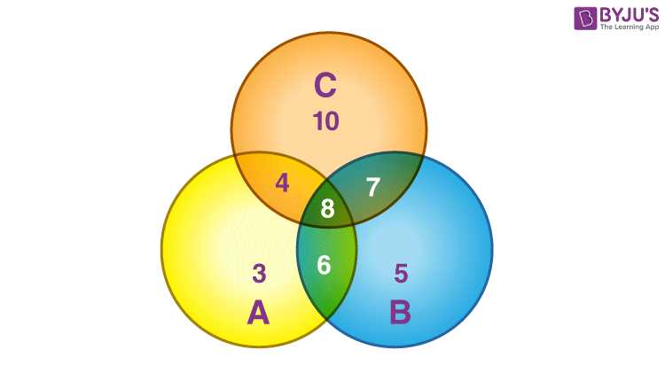
One frequent mistake is inaccurately depicting the overlapping regions, which can mislead viewers about the relationships between the sets. Ensure that the intersections reflect the true connections; otherwise, the representation may not convey the right information.
Neglecting Clear Labels
Another critical oversight is failing to label the individual sections clearly. Without appropriate identifiers, the audience may struggle to understand what each part represents. Providing concise and descriptive labels is vital for effective communication.
Real-World Examples of Venn Diagrams
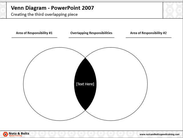
Overlapping circles serve as a powerful visual tool for illustrating relationships among different sets. These representations are widely used across various fields to analyze similarities and differences, making complex information more accessible and understandable.
Here are some practical applications where these illustrations can be effectively utilized:
- Education:
- Comparing different historical periods to highlight key events.
- Examining the similarities and differences between literary characters.
- Marketing:
- Identifying target audiences for distinct product lines.
- Analyzing consumer preferences across competing brands.
- Healthcare:
- Understanding the overlap of symptoms between various diseases.
- Comparing treatment outcomes for different patient demographics.
- Environmental Studies:
- Assessing the impact of urban development on local wildlife.
- Examining the relationships between pollution sources and affected areas.
These visual tools not only enhance comprehension but also facilitate discussions and decision-making processes across diverse sectors.
Benefits of Using Venn Diagrams
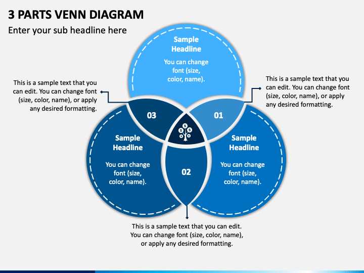
Utilizing overlapping circles to represent relationships and commonalities offers numerous advantages in various fields. These visual tools simplify complex information, making it easier to understand connections and distinctions between different concepts. By presenting data in a clear manner, they enhance comprehension and retention.
One significant benefit is their ability to facilitate comparison. Users can quickly identify similarities and differences, which aids in decision-making processes. This clarity is invaluable in education, business, and research, where effective communication of ideas is essential.
Additionally, these visuals encourage collaborative discussions. When working in teams, individuals can engage more effectively by visualizing how their ideas intersect or diverge, leading to more productive brainstorming sessions. This collective analysis fosters creativity and innovation.
Moreover, they can help in problem-solving by highlighting areas that require attention. By laying out various elements, individuals can pinpoint potential solutions or areas for improvement more efficiently. This strategic approach can ultimately lead to more informed conclusions.
Software Tools for Diagram Creation
In today’s digital age, various applications empower users to visualize relationships and data effectively. These platforms enable individuals to create representations that enhance understanding and communication of complex ideas.
Popular Applications
Some widely used tools include Lucidchart, which offers intuitive features for crafting professional visuals, and Canva, known for its user-friendly interface and extensive template library. Both options cater to diverse needs, from casual projects to formal presentations.
Advanced Features
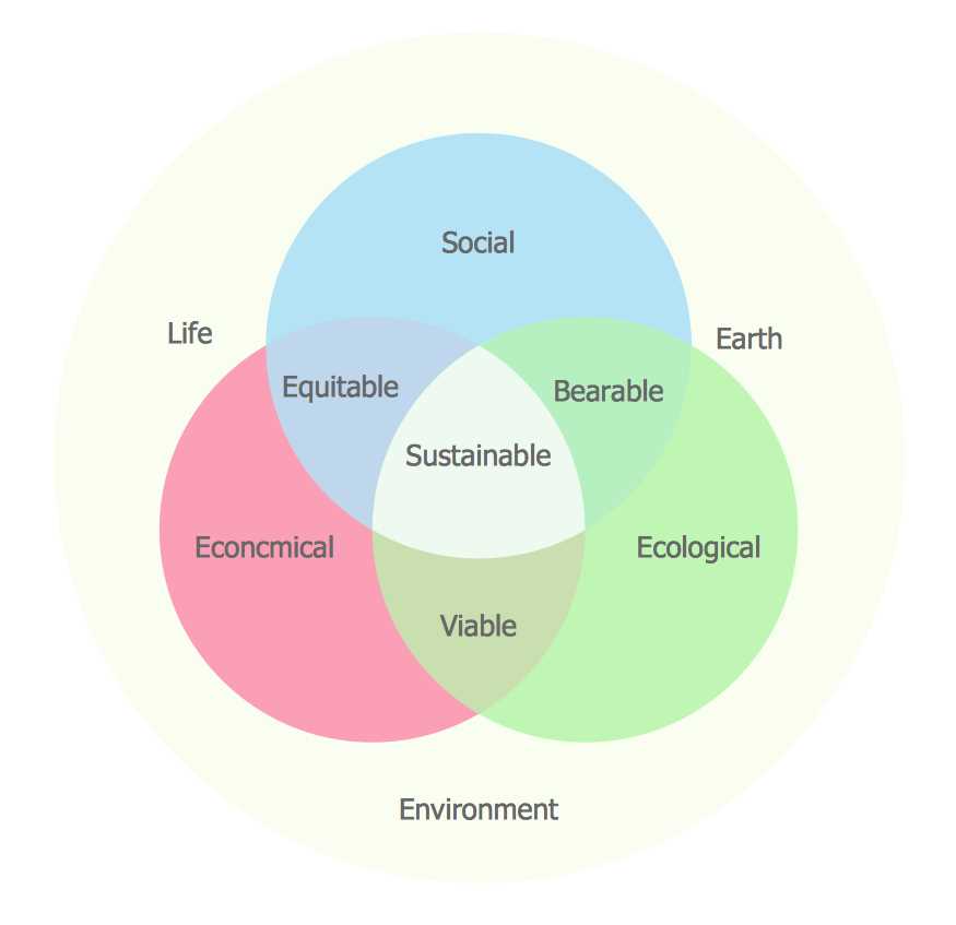
Many of these solutions provide collaboration capabilities, allowing teams to work simultaneously and share insights in real time. Additionally, integrations with other software can streamline workflows, making the creation process even more efficient.
Teaching Concepts with Venn Diagrams
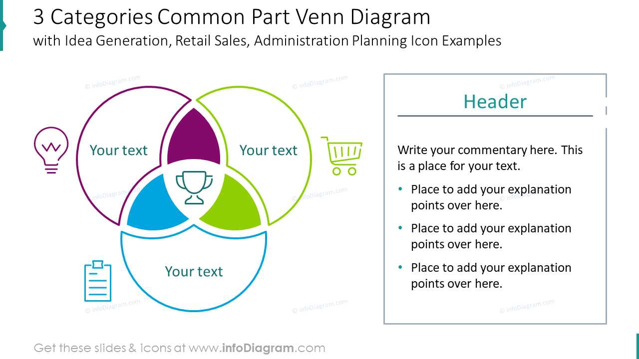
Visual representations play a crucial role in enhancing understanding of complex ideas. By comparing and contrasting different concepts, learners can easily grasp relationships and identify similarities and differences. This approach is particularly effective in various educational settings, from elementary to higher education.
Using these graphical tools in the classroom can foster critical thinking and analytical skills. Here are some benefits of incorporating such visual aids in teaching:
- Clarification of Relationships: Helps students see how different concepts intersect.
- Enhanced Engagement: Visuals capture attention and encourage participation.
- Improved Retention: Information presented visually is often easier to remember.
When introducing these visual aids, educators can follow these steps:
- Identify the Concepts: Choose two or more ideas for comparison.
- Draw the Representation: Create a simple visual to illustrate the relationships.
- Encourage Discussion: Facilitate a dialogue around the visual, prompting students to share observations.
- Apply the Knowledge: Assign exercises where students create their own visuals based on new topics.
Incorporating such visuals into lessons not only simplifies complex information but also promotes an interactive learning environment. This method ultimately aids in developing a deeper understanding of the material presented.